Oak Park Public Library Rebrand
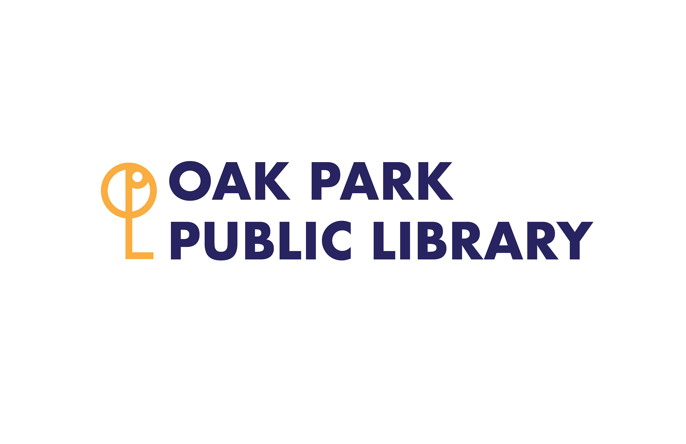
This project required a rebrand of an established local brand whose logo was outdated. I created a new visual identity and logo for the Oak Park Public Library. The old logo was a cliche of a book and didn’t represent the full scope of services offered at the library.
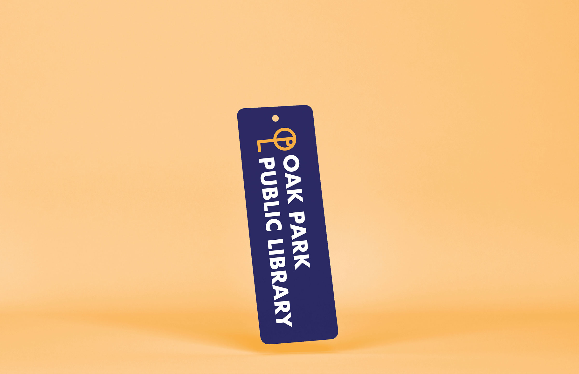
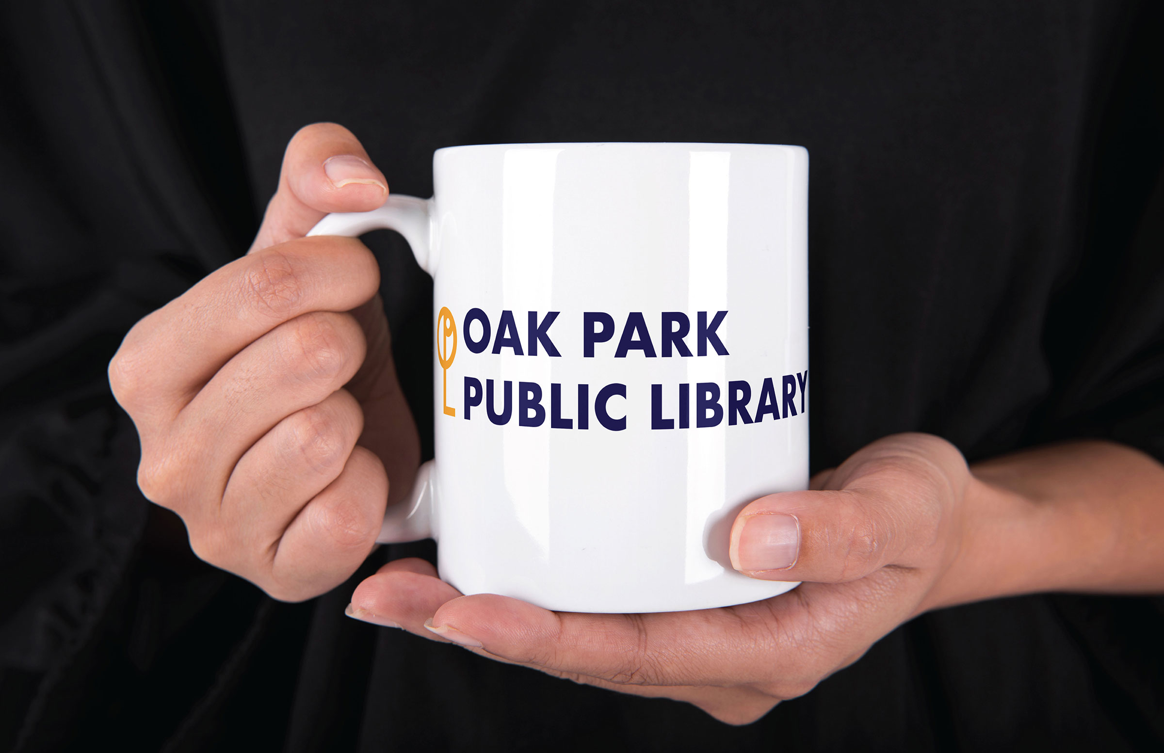
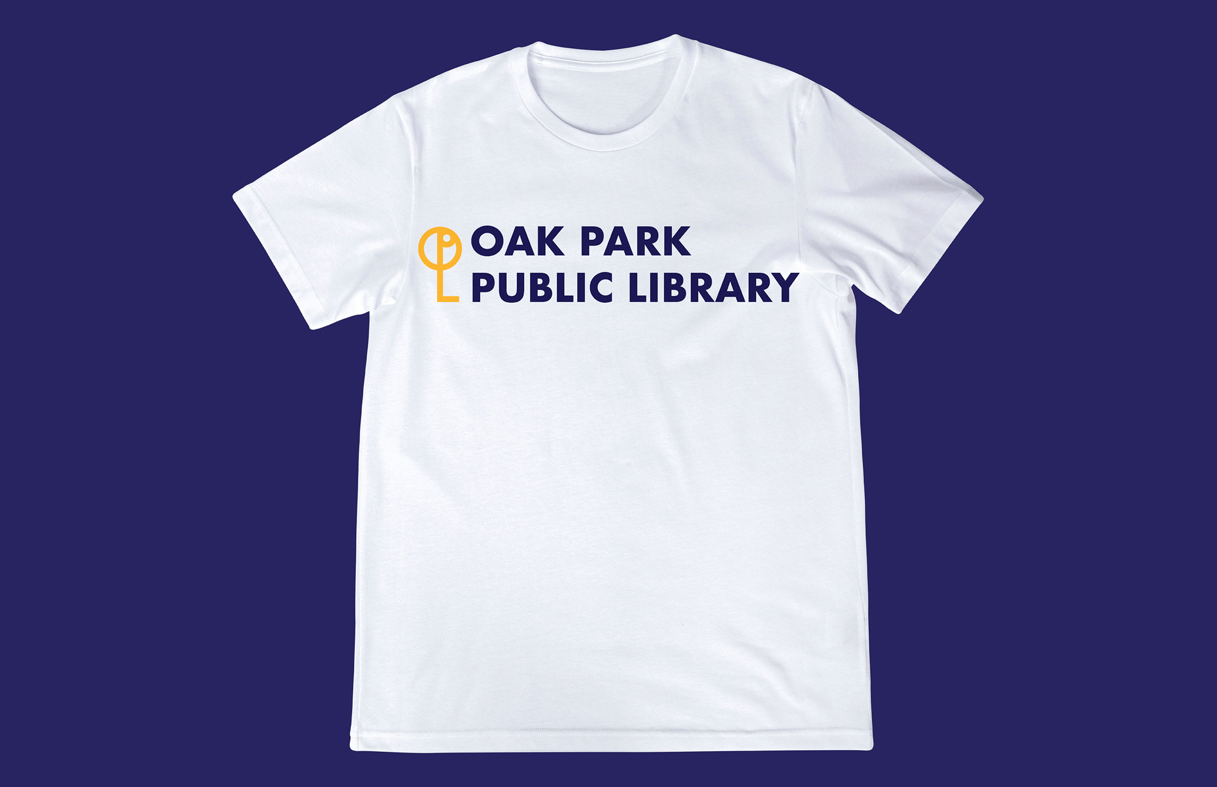
The redesigned logo uses the letters “OPPL” to create a key. Not only is this key used to symbolize the Oak Park Library, it also symbolizes new discovery, accessibility, and opportunity to gain knowledge in many ways. It is stylized to pay homage to the Prairie Style influences that can be seen on many of Oak Park's homes and buildings.
Design Tools: Illustrator, Photoshop
Project Focus: Logo Redesign, Rebranding